
A renovation website that puts the work first, makes the offer easy to understand, and gives prospective clients a direct path to an estimate conversation.
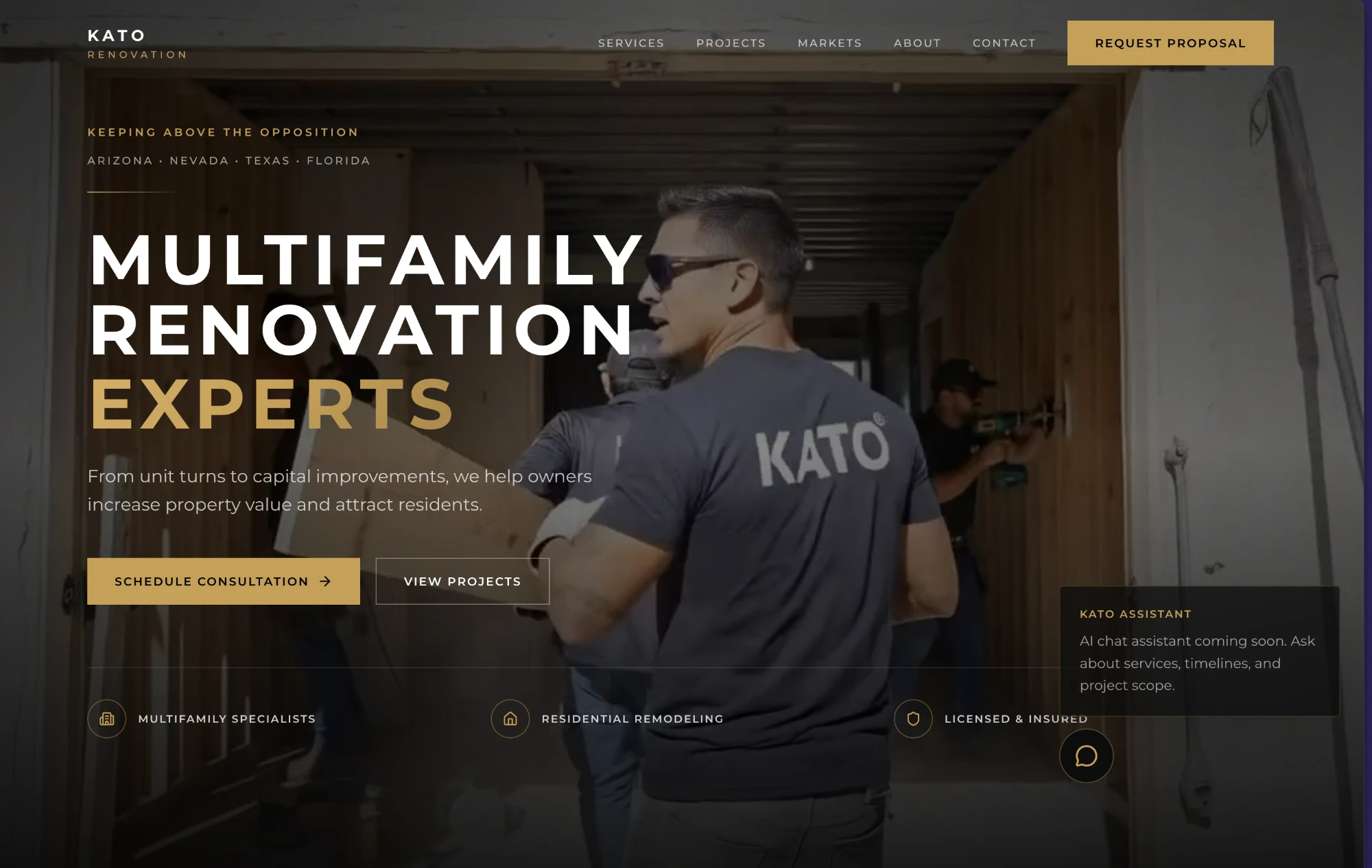
The brief was trust before the first call.
Renovation is a visual, local, high-consideration decision. The website needed to make KATO's work feel credible quickly, explain the offer without friction, and hold up on the phone where many project searches begin.
The response was a restrained visual system that lets project imagery carry the proof. Service information, company context, and inquiry actions were organized around the questions a prospective client is likely to ask before reaching out.
- 01
Project-first hierarchy
Lead with the finished work, then support it with the information needed to judge fit.
- 02
Clear service paths
Give each kind of renovation work a direct place in the information structure.
- 03
Visible next steps
Keep estimate and contact actions easy to find without turning every section into a sales prompt.
- 04
Mobile-ready delivery
Preserve visual confidence and readable decision paths on smaller screens.
A clearer digital front door for the business.
The delivered outcome is a live website that presents the portfolio, explains the work, and makes starting a conversation straightforward across desktop and mobile.
This case study shows the delivered website. Traffic, ranking, and lead metrics are not published here because verified client source data has not been provided for publication.
Have a similar brief?
Bring the current site, the business goal, and what is not working. We will help you identify the right first move.
Discuss your website